Through creating this magazine I have learnt a great deal about the technology I used and worked with. For Example, I expanded my knowledge of my DSLR in order to take effective, high quality photographs. I learned how to better my photographs using Corel Paint Shop Pro, and how to remove imperfections. I learnt how to use Blogger to create an informative, easy to read blog where I can show off an explain my AS level media coursework. I discovered how to enhance my knowledge of ICT skills in order to apply them to my media course.
Friday, 8 April 2011
How does my magazine attract and appeal to the target audience?
To attract the target audience to my magazine I used images of a young, down to earth looking new singer, who people can relate to, so they are more likely to buy the magazine to read about someone they like. I used fresh, bright colours to draw the eye and grab the reader’s attention. The effects are urban and cool, but do not defer from the image or the text. I contrasted the colours in the way I used the blandness of the grey and the bright yellow, in order to emphasise the text or images that were written or outlined in the yellow. The affect this will have on the audience is their being drawn to the colours which stand out on the shelf and catch their eye; making them interested in what it is that stood out to them from the rest. Therefore they will be more inclined to buy it.
How does my magazine present social groups?
My music magazine used a stereotypical image of a young girl dressed in modern stylish clothes, as thre main cover star. I did this so as to create certain expectations within the audience, and, because there are girls similar to the one on the cover, young girls are more likely to read the magazine because they can relate to her. I used an image of a boy in sunglasses and a football shirt to represent the young, 'cool' youth of today, who is stylish and into football; very stereotypical. I did this so I could appeal to a wider audience of both male and female young people.
Forms & Conventions
My music magazine uses, develops and challenges forms and conventions of real music magazines in its design, layout and mise en scene. I used all the codes and conventions of modern music magazines, in the way that my music magazine includes similar aspects as of those of the current magazines being distributed in the UK
Feedback
I asked two friends, Joe Richards and Ben Farrell to look at my magazine and tell em how effective they thought it was. Joe said, about my front cover; "I think the colours are eye-catching and electric. The -what do I call it? Masthead?- masthead jumps out the page at me and the glow around the words add to the vibrant effect. I like the theme of the colours- it appeals to a younger generation. The whole page draws me in- I'd buy it yeah!"
About my contents page, Ben said "It's so clearly laid out, it would be very easy for me to find a feature I particularly wanted to read. I like the contrast and balance of text and images, too much of either would be overpowering. I like how the theme from the front cover is extended onto this page too."
Ben said, about my double page spread "the use of images are effective and adds interest and contrast to the page. It is a good balance between image and text, again, and I like the simplicity of the interview- one colour for the interviewer and one for 'Ems'. Its easy reading! The rectangle of colour behind the large image adds a splash of colour but doesn't defer the eye from the image and the interview. very effective!"
Evaluation of my Skills
This is an evaluation of my magazine-producing skills;
Since acquiring a DSLR camera, I have put it to good use with my as media coursework- I have used it to take the high-quality photos I have used for my magazine. I used the different scene options to change the settings and to take the best images I could. in low light I used the 'high key' scene setting which emphasised lighter areas, or, of course, the flash. If there was too much light I used the 'low key' setting which emphasised the dark areas of a scene. Most of the time because there was sufficient lighting I used the "Portrait" scene setting because it is best for taking pictures of people in a 'potrait' style, and for the grass I used the "macro" setting, to take close up images of small objects, i.e. the blades of grass. I used auto-focus on the images of people, to focus in on their faces and bodies, but for the grass I used the manual focus found on the lens, so I was able to focus on the blades of grass of my choice.
When uploading the images to my laptop, I needed to edit them to cut out the background to make it appear more professional. To do this I used Corel Pain Shop Pro X2, and in particular, the 'magic wand' tool, which selected areas of the same colour to cut, when you clicked on a specific area of the image. This I found useful as I did not have to waste time going all around the subject of my image with the 'Lasso' cutting tool. I could then add in a background colour of my choice. I then used sharpening techniques to enhance the images, and the crop tool to cut out any excess background.
What I found to be my downfall when creating my magazine was not taking enough pictures of my subjects, and therefore having limited choice when it came to choosing the images I would use. However I think the images I DID use were effective enough. In future productions I would definitely take over 100 shots, to have a wider variety of images to choose from.
Analysing my Music Magazine- Contents
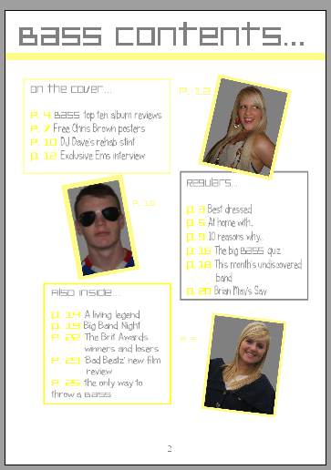
This image is of the contents page of my magazine:
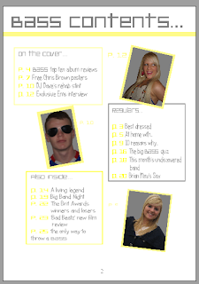
The theme of my contents page continues on from the front page with the colours and the fonts. The white, grey and yellow colours of the background and text from the front page are carried onto the contents page, but reversed. Whereas on the front cover the background was grey with yellow and white features, on the contents page the background is white and the features are yellow and grey. The page title is written in the same font as the masthead on the front cover, in grey which contrasts greatly to the background and is easy to see. There are three main text boxes on the contents page, which all contain the features within the magazine. The first box comes under the page title, and contains the features which were on the front cover. The title of this text box is "On The Cover..." and has a yellow border to section it off from the rest of the page, has yellow page numbers so the page number is easily distinguisghed from the actual contents. The first photo on the page is to the right of this box, and is of Ems (the cover star) and has a yellow border to make the image stand out, and also to tie in with the rest of the theme. There is a page number next to this image, which makes the feature easy to find in the magazine. It is at an angle which adds interest to the page. Underneath this image is another text box with a grey border, which is overlapped by the image of Ems. This box contains the "Regulars.." features, and the font is in grey with the page numbers in yellow. There is an image to the left of this of "DJ Dave" which is also at an angle, with a yellow border. The final text box is underneath the image if DJ Dave, and has a yellow border with the title "Also inside..". The font is grey again, with the page numbers in yellow. The last image is of me (I had little time and few willing subjects to take it of anyone else) and is again outlined by a yellow border, with a page number near to it. The layout is very clear and it would be easy to find a specific feature within the magazine.
The theme of my contents page continues on from the front page with the colours and the fonts. The white, grey and yellow colours of the background and text from the front page are carried onto the contents page, but reversed. Whereas on the front cover the background was grey with yellow and white features, on the contents page the background is white and the features are yellow and grey. The page title is written in the same font as the masthead on the front cover, in grey which contrasts greatly to the background and is easy to see. There are three main text boxes on the contents page, which all contain the features within the magazine. The first box comes under the page title, and contains the features which were on the front cover. The title of this text box is "On The Cover..." and has a yellow border to section it off from the rest of the page, has yellow page numbers so the page number is easily distinguisghed from the actual contents. The first photo on the page is to the right of this box, and is of Ems (the cover star) and has a yellow border to make the image stand out, and also to tie in with the rest of the theme. There is a page number next to this image, which makes the feature easy to find in the magazine. It is at an angle which adds interest to the page. Underneath this image is another text box with a grey border, which is overlapped by the image of Ems. This box contains the "Regulars.." features, and the font is in grey with the page numbers in yellow. There is an image to the left of this of "DJ Dave" which is also at an angle, with a yellow border. The final text box is underneath the image if DJ Dave, and has a yellow border with the title "Also inside..". The font is grey again, with the page numbers in yellow. The last image is of me (I had little time and few willing subjects to take it of anyone else) and is again outlined by a yellow border, with a page number near to it. The layout is very clear and it would be easy to find a specific feature within the magazine.
Subscribe to:
Comments (Atom)