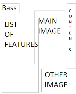
 After designing a front cover layout, I then had to think about the contents page of my magazine. The following are a few of the designs I came up with for my music magazine contents' page...
I decided to use the second layout, because I thought it looked spacious and clearly laid out, with different boxes containing the contents so locating a specific feature within the magazine would be easy.
The title of the page will be "Bass Contents.." in the same font as the masthead on the front cover, so it ties in with the same fonts and themes. The colour scheme on the contents page will follow on from the front cover, with the grey white and yellow. The background will be white, to contrast from the grey of the front, but the text will be grey and the boxes will have a yellow outline. There will be three main text boxes on the contents page, one under the title on the left, which will include the "on the cover" features, and clearly marked page numbers, another box will be under this one but to the right, which will be the "regulars" features, and the last box will be the "also inside" features. Each box will have a picture which relates to it, to the side of it, either the left or right, depending on the spacing, also with page numbers next to it.


No comments:
Post a Comment