This image is of the contents page of my magazine:
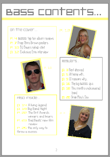
The theme of my contents page continues on from the front page with the colours and the fonts. The white, grey and yellow colours of the background and text from the front page are carried onto the contents page, but reversed. Whereas on the front cover the background was grey with yellow and white features, on the contents page the background is white and the features are yellow and grey. The page title is written in the same font as the masthead on the front cover, in grey which contrasts greatly to the background and is easy to see. There are three main text boxes on the contents page, which all contain the features within the magazine. The first box comes under the page title, and contains the features which were on the front cover. The title of this text box is "On The Cover..." and has a yellow border to section it off from the rest of the page, has yellow page numbers so the page number is easily distinguisghed from the actual contents. The first photo on the page is to the right of this box, and is of Ems (the cover star) and has a yellow border to make the image stand out, and also to tie in with the rest of the theme. There is a page number next to this image, which makes the feature easy to find in the magazine. It is at an angle which adds interest to the page. Underneath this image is another text box with a grey border, which is overlapped by the image of Ems. This box contains the "Regulars.." features, and the font is in grey with the page numbers in yellow. There is an image to the left of this of "DJ Dave" which is also at an angle, with a yellow border. The final text box is underneath the image if DJ Dave, and has a yellow border with the title "Also inside..". The font is grey again, with the page numbers in yellow. The last image is of me (I had little time and few willing subjects to take it of anyone else) and is again outlined by a yellow border, with a page number near to it. The layout is very clear and it would be easy to find a specific feature within the magazine.
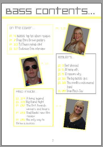
The theme of my contents page continues on from the front page with the colours and the fonts. The white, grey and yellow colours of the background and text from the front page are carried onto the contents page, but reversed. Whereas on the front cover the background was grey with yellow and white features, on the contents page the background is white and the features are yellow and grey. The page title is written in the same font as the masthead on the front cover, in grey which contrasts greatly to the background and is easy to see. There are three main text boxes on the contents page, which all contain the features within the magazine. The first box comes under the page title, and contains the features which were on the front cover. The title of this text box is "On The Cover..." and has a yellow border to section it off from the rest of the page, has yellow page numbers so the page number is easily distinguisghed from the actual contents. The first photo on the page is to the right of this box, and is of Ems (the cover star) and has a yellow border to make the image stand out, and also to tie in with the rest of the theme. There is a page number next to this image, which makes the feature easy to find in the magazine. It is at an angle which adds interest to the page. Underneath this image is another text box with a grey border, which is overlapped by the image of Ems. This box contains the "Regulars.." features, and the font is in grey with the page numbers in yellow. There is an image to the left of this of "DJ Dave" which is also at an angle, with a yellow border. The final text box is underneath the image if DJ Dave, and has a yellow border with the title "Also inside..". The font is grey again, with the page numbers in yellow. The last image is of me (I had little time and few willing subjects to take it of anyone else) and is again outlined by a yellow border, with a page number near to it. The layout is very clear and it would be easy to find a specific feature within the magazine.
No comments:
Post a Comment