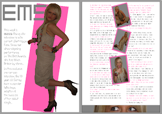
This image is of my double page spread for my music magazine, "Bass".
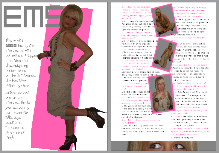
The theme of the magazine being grey, white and yellow is slightly altered on these pages, in the way that the yellow hass been replaced with baby pink so it is more relevant to the feature- in particular the artist that the article is about. I decided to call my artist "Ems" which is a nickname for my model's actual name- Emily. I wrote her name in pink in the same font as the masthead on the front cover (platinum beat btn) which contrasts to the white background and catches the eye. The image on the first page of the double page spread is a full length one of Ems standing side on but looking at the camera, with one knee bent behind her. I dressed my model in an ankle-length plain beige jumpsuit and brown high heels, but added splashes with her jewellry- I added a lot of multi-coloured bracelets, necklaces and earrings, and bright lipstick. She wore her hair straight and smooth to add some glamour. I dressed Ems in this way because the look I wanted to create was one of a young, modern, down to earth girl, so the readers can relate to her and be more inclined to buy the magazine. I cut out the background of the original image on Corel photoshop X2 and then added a block of colour behind the image at an angle, which made it stand out against the white background and added an element of colour to the page. The introduction to the interview wraps around the image, to the left, and is written in the same alternative font I used on the front cover, and in grey, so as to carry the theme on into the magazine. On the facing page, I used four images, three down the centre of the page and one at the bottom. The three in the middle are at angles to each other and have a border in the same pink colour as the block background on the opposite page. These three are all images which shows a fun side to Ems. The image at the bottom was cut from one of the central images, it shows just her eyes, and I have included the grey background which makes it appear as though Ems is looking through blinds or a letterbox. This shows a misschevious side and is eye-catching and interesting for the reader. I chose to use a variety of images in the double page spread so I could create a good balance between text and pictures, so there was more visual effects to the feature. The interview itself flows around both sides of the central images and the text wraps around the pictures. The interviewer's text is in the same grey as the introduction and Ems' text is in the same pink as the page title and other pink features, in order to co-ordinate with the theme, and to make reading the interview simpler for the reader, also to make sure the words stand out from the white background. The font is simple and easy to read. I think it works well as a double page spread because it is easy to read, with a good balance of text and images, with different fonts and colours which attract the eye.
The theme of the magazine being grey, white and yellow is slightly altered on these pages, in the way that the yellow hass been replaced with baby pink so it is more relevant to the feature- in particular the artist that the article is about. I decided to call my artist "Ems" which is a nickname for my model's actual name- Emily. I wrote her name in pink in the same font as the masthead on the front cover (platinum beat btn) which contrasts to the white background and catches the eye. The image on the first page of the double page spread is a full length one of Ems standing side on but looking at the camera, with one knee bent behind her. I dressed my model in an ankle-length plain beige jumpsuit and brown high heels, but added splashes with her jewellry- I added a lot of multi-coloured bracelets, necklaces and earrings, and bright lipstick. She wore her hair straight and smooth to add some glamour. I dressed Ems in this way because the look I wanted to create was one of a young, modern, down to earth girl, so the readers can relate to her and be more inclined to buy the magazine. I cut out the background of the original image on Corel photoshop X2 and then added a block of colour behind the image at an angle, which made it stand out against the white background and added an element of colour to the page. The introduction to the interview wraps around the image, to the left, and is written in the same alternative font I used on the front cover, and in grey, so as to carry the theme on into the magazine. On the facing page, I used four images, three down the centre of the page and one at the bottom. The three in the middle are at angles to each other and have a border in the same pink colour as the block background on the opposite page. These three are all images which shows a fun side to Ems. The image at the bottom was cut from one of the central images, it shows just her eyes, and I have included the grey background which makes it appear as though Ems is looking through blinds or a letterbox. This shows a misschevious side and is eye-catching and interesting for the reader. I chose to use a variety of images in the double page spread so I could create a good balance between text and pictures, so there was more visual effects to the feature. The interview itself flows around both sides of the central images and the text wraps around the pictures. The interviewer's text is in the same grey as the introduction and Ems' text is in the same pink as the page title and other pink features, in order to co-ordinate with the theme, and to make reading the interview simpler for the reader, also to make sure the words stand out from the white background. The font is simple and easy to read. I think it works well as a double page spread because it is easy to read, with a good balance of text and images, with different fonts and colours which attract the eye.
No comments:
Post a Comment