The image below is of the front cover of my music magazine:

I called my magazine 'Bass', because there is a lot of bass in the Dance music genre, and I wanted to include dance music into my magazine because it was popular in the questionnaire.
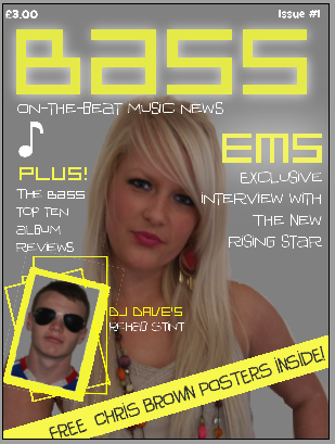
I called my magazine 'Bass', because there is a lot of bass in the Dance music genre, and I wanted to include dance music into my magazine because it was popular in the questionnaire.
I gave the masthead a white glow, so it stands out and is eye catching for the buyer, with a vibrant, urban look. The only other text I used a glow for was ‘Ems ’ because after the masthead, it is the most important word on the front cover, being the main feature.
I decided on my slogan being “On-the-beat music news” because it gives the feeling of the magazine being up-to-date and fresh, because on-the-beat is referring to a music beat, and also it means to be current.
My main image is of the pop star ‘Ems ’, and is anchored by her name in yellow, and the words “exclusive interview with the new rising star”. These words aim to entice the buyer, because ‘exclusive’ is an important word in media, meaning no other magazine (or radio/tv channel etc.) has had this interview, therefore this is the only magazine you can buy to read this interview. The image is of Ems looking straight at the camera, which suggests honesty, but her smile is closed, implying a certain amount of information might be withheld. She has her hand on her hip which suggests attitude, which I tried to incorporate into my magazine.
The image of ‘DJ Dave’ is anchored by the text explaining he has been in rehab, and the border and other rectangles surrounding this image are made to have a psychedelic-look, relating to the fact that he went to rehab to cure his drug-addiction- drugs make you spaced out, and the angle of the picture makes it seem as though DJ Dave is spiralling downwards, because of his addiction.
The strip of yellow at an angle at the bottom of the page stands out against the grey background to catch the buyer’s eye. The text being in capitals makes the words stand out, and because the posters are free, the buyer is more inclined to purchase the magazine because they don’t have to pay extra.
No comments:
Post a Comment