Through creating this magazine I have learnt a great deal about the technology I used and worked with. For Example, I expanded my knowledge of my DSLR in order to take effective, high quality photographs. I learned how to better my photographs using Corel Paint Shop Pro, and how to remove imperfections. I learnt how to use Blogger to create an informative, easy to read blog where I can show off an explain my AS level media coursework. I discovered how to enhance my knowledge of ICT skills in order to apply them to my media course.
Friday, 8 April 2011
How does my magazine attract and appeal to the target audience?
To attract the target audience to my magazine I used images of a young, down to earth looking new singer, who people can relate to, so they are more likely to buy the magazine to read about someone they like. I used fresh, bright colours to draw the eye and grab the reader’s attention. The effects are urban and cool, but do not defer from the image or the text. I contrasted the colours in the way I used the blandness of the grey and the bright yellow, in order to emphasise the text or images that were written or outlined in the yellow. The affect this will have on the audience is their being drawn to the colours which stand out on the shelf and catch their eye; making them interested in what it is that stood out to them from the rest. Therefore they will be more inclined to buy it.
How does my magazine present social groups?
My music magazine used a stereotypical image of a young girl dressed in modern stylish clothes, as thre main cover star. I did this so as to create certain expectations within the audience, and, because there are girls similar to the one on the cover, young girls are more likely to read the magazine because they can relate to her. I used an image of a boy in sunglasses and a football shirt to represent the young, 'cool' youth of today, who is stylish and into football; very stereotypical. I did this so I could appeal to a wider audience of both male and female young people.
Forms & Conventions
My music magazine uses, develops and challenges forms and conventions of real music magazines in its design, layout and mise en scene. I used all the codes and conventions of modern music magazines, in the way that my music magazine includes similar aspects as of those of the current magazines being distributed in the UK
Feedback
I asked two friends, Joe Richards and Ben Farrell to look at my magazine and tell em how effective they thought it was. Joe said, about my front cover; "I think the colours are eye-catching and electric. The -what do I call it? Masthead?- masthead jumps out the page at me and the glow around the words add to the vibrant effect. I like the theme of the colours- it appeals to a younger generation. The whole page draws me in- I'd buy it yeah!"
About my contents page, Ben said "It's so clearly laid out, it would be very easy for me to find a feature I particularly wanted to read. I like the contrast and balance of text and images, too much of either would be overpowering. I like how the theme from the front cover is extended onto this page too."
Ben said, about my double page spread "the use of images are effective and adds interest and contrast to the page. It is a good balance between image and text, again, and I like the simplicity of the interview- one colour for the interviewer and one for 'Ems'. Its easy reading! The rectangle of colour behind the large image adds a splash of colour but doesn't defer the eye from the image and the interview. very effective!"
Evaluation of my Skills
This is an evaluation of my magazine-producing skills;
Since acquiring a DSLR camera, I have put it to good use with my as media coursework- I have used it to take the high-quality photos I have used for my magazine. I used the different scene options to change the settings and to take the best images I could. in low light I used the 'high key' scene setting which emphasised lighter areas, or, of course, the flash. If there was too much light I used the 'low key' setting which emphasised the dark areas of a scene. Most of the time because there was sufficient lighting I used the "Portrait" scene setting because it is best for taking pictures of people in a 'potrait' style, and for the grass I used the "macro" setting, to take close up images of small objects, i.e. the blades of grass. I used auto-focus on the images of people, to focus in on their faces and bodies, but for the grass I used the manual focus found on the lens, so I was able to focus on the blades of grass of my choice.
When uploading the images to my laptop, I needed to edit them to cut out the background to make it appear more professional. To do this I used Corel Pain Shop Pro X2, and in particular, the 'magic wand' tool, which selected areas of the same colour to cut, when you clicked on a specific area of the image. This I found useful as I did not have to waste time going all around the subject of my image with the 'Lasso' cutting tool. I could then add in a background colour of my choice. I then used sharpening techniques to enhance the images, and the crop tool to cut out any excess background.
What I found to be my downfall when creating my magazine was not taking enough pictures of my subjects, and therefore having limited choice when it came to choosing the images I would use. However I think the images I DID use were effective enough. In future productions I would definitely take over 100 shots, to have a wider variety of images to choose from.
Analysing my Music Magazine- Contents
This image is of the contents page of my magazine:
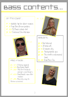
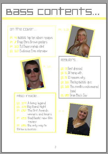
The theme of my contents page continues on from the front page with the colours and the fonts. The white, grey and yellow colours of the background and text from the front page are carried onto the contents page, but reversed. Whereas on the front cover the background was grey with yellow and white features, on the contents page the background is white and the features are yellow and grey. The page title is written in the same font as the masthead on the front cover, in grey which contrasts greatly to the background and is easy to see. There are three main text boxes on the contents page, which all contain the features within the magazine. The first box comes under the page title, and contains the features which were on the front cover. The title of this text box is "On The Cover..." and has a yellow border to section it off from the rest of the page, has yellow page numbers so the page number is easily distinguisghed from the actual contents. The first photo on the page is to the right of this box, and is of Ems (the cover star) and has a yellow border to make the image stand out, and also to tie in with the rest of the theme. There is a page number next to this image, which makes the feature easy to find in the magazine. It is at an angle which adds interest to the page. Underneath this image is another text box with a grey border, which is overlapped by the image of Ems. This box contains the "Regulars.." features, and the font is in grey with the page numbers in yellow. There is an image to the left of this of "DJ Dave" which is also at an angle, with a yellow border. The final text box is underneath the image if DJ Dave, and has a yellow border with the title "Also inside..". The font is grey again, with the page numbers in yellow. The last image is of me (I had little time and few willing subjects to take it of anyone else) and is again outlined by a yellow border, with a page number near to it. The layout is very clear and it would be easy to find a specific feature within the magazine.
The theme of my contents page continues on from the front page with the colours and the fonts. The white, grey and yellow colours of the background and text from the front page are carried onto the contents page, but reversed. Whereas on the front cover the background was grey with yellow and white features, on the contents page the background is white and the features are yellow and grey. The page title is written in the same font as the masthead on the front cover, in grey which contrasts greatly to the background and is easy to see. There are three main text boxes on the contents page, which all contain the features within the magazine. The first box comes under the page title, and contains the features which were on the front cover. The title of this text box is "On The Cover..." and has a yellow border to section it off from the rest of the page, has yellow page numbers so the page number is easily distinguisghed from the actual contents. The first photo on the page is to the right of this box, and is of Ems (the cover star) and has a yellow border to make the image stand out, and also to tie in with the rest of the theme. There is a page number next to this image, which makes the feature easy to find in the magazine. It is at an angle which adds interest to the page. Underneath this image is another text box with a grey border, which is overlapped by the image of Ems. This box contains the "Regulars.." features, and the font is in grey with the page numbers in yellow. There is an image to the left of this of "DJ Dave" which is also at an angle, with a yellow border. The final text box is underneath the image if DJ Dave, and has a yellow border with the title "Also inside..". The font is grey again, with the page numbers in yellow. The last image is of me (I had little time and few willing subjects to take it of anyone else) and is again outlined by a yellow border, with a page number near to it. The layout is very clear and it would be easy to find a specific feature within the magazine.
Thursday, 7 April 2011
What Have I Learnt?
What I have learnt since my preliminary task is;
- How to effectively use Corel paint shop pro to edit images, and to create the pages for my magazine
- How to add a glow to text- The masthead and anchorage text on my front page
- How to use my DSLR to take professional-looking photos
- How to use the space on my front page more effectively, to enlarge text/images to fill the empty spaces
- How to use a colour scheme more effectively and how to change some colours but to still stay within the theme
Who would Publish my Magazine?
The media institution who would market and distribute my magazine would perhaps be Bauer Media- they reach over nineteen million adults in the UK across various media types, and owns over eighty influential media brands such as Heat, Kiss100, Kerrang!, and Q. I would choose this media owner because Bauer is renowned for being extremely popular and successful; because of the well known brand, my magazine would have a fair chance at being well published and widely distributed-increasing the magazine’s change of success.
Target Audience
Who would buy my magazine?
The audience which my magazine would appeal to would be a young audience of between 14 and 25, who are into the dance/pop/rnb music scene, because that is the sort of music I would include in my magazine. Both male and female audiences would buy this magazine as it incorporates a mix of interests for both men and woman, so as to appeal to a wider audience of both sexes.
Skills
The skills I have learnt through photoshop and photography when creating my music magazine are;
· How to sharpen an image, it appears to bring out detail that was not there before, whereas what it actually does is emphasise the edges and make them easier for the eye to pick out, making the image seem sharper- no new details are actually brought out.
· How to enhance the skin tone so there are fewer blemishes and imperfections so the image looks more professional, because all magazines use photoshop to enhance their image so it will look more like a professional magazine.
· How to make the mise-en-scene minimalist and contrasting in colour to the focus of the image, so the background is easier to cut out and edit later
Analysing my Music Magazine- Double Page Spread
This image is of my double page spread for my music magazine, "Bass".
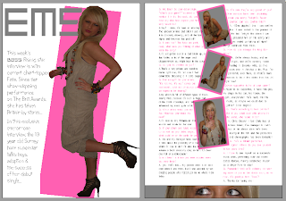
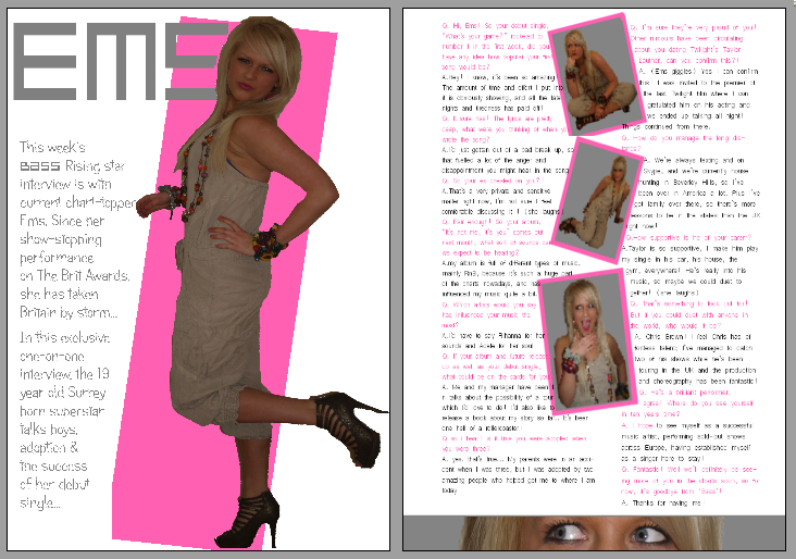
The theme of the magazine being grey, white and yellow is slightly altered on these pages, in the way that the yellow hass been replaced with baby pink so it is more relevant to the feature- in particular the artist that the article is about. I decided to call my artist "Ems" which is a nickname for my model's actual name- Emily. I wrote her name in pink in the same font as the masthead on the front cover (platinum beat btn) which contrasts to the white background and catches the eye. The image on the first page of the double page spread is a full length one of Ems standing side on but looking at the camera, with one knee bent behind her. I dressed my model in an ankle-length plain beige jumpsuit and brown high heels, but added splashes with her jewellry- I added a lot of multi-coloured bracelets, necklaces and earrings, and bright lipstick. She wore her hair straight and smooth to add some glamour. I dressed Ems in this way because the look I wanted to create was one of a young, modern, down to earth girl, so the readers can relate to her and be more inclined to buy the magazine. I cut out the background of the original image on Corel photoshop X2 and then added a block of colour behind the image at an angle, which made it stand out against the white background and added an element of colour to the page. The introduction to the interview wraps around the image, to the left, and is written in the same alternative font I used on the front cover, and in grey, so as to carry the theme on into the magazine. On the facing page, I used four images, three down the centre of the page and one at the bottom. The three in the middle are at angles to each other and have a border in the same pink colour as the block background on the opposite page. These three are all images which shows a fun side to Ems. The image at the bottom was cut from one of the central images, it shows just her eyes, and I have included the grey background which makes it appear as though Ems is looking through blinds or a letterbox. This shows a misschevious side and is eye-catching and interesting for the reader. I chose to use a variety of images in the double page spread so I could create a good balance between text and pictures, so there was more visual effects to the feature. The interview itself flows around both sides of the central images and the text wraps around the pictures. The interviewer's text is in the same grey as the introduction and Ems' text is in the same pink as the page title and other pink features, in order to co-ordinate with the theme, and to make reading the interview simpler for the reader, also to make sure the words stand out from the white background. The font is simple and easy to read. I think it works well as a double page spread because it is easy to read, with a good balance of text and images, with different fonts and colours which attract the eye.
The theme of the magazine being grey, white and yellow is slightly altered on these pages, in the way that the yellow hass been replaced with baby pink so it is more relevant to the feature- in particular the artist that the article is about. I decided to call my artist "Ems" which is a nickname for my model's actual name- Emily. I wrote her name in pink in the same font as the masthead on the front cover (platinum beat btn) which contrasts to the white background and catches the eye. The image on the first page of the double page spread is a full length one of Ems standing side on but looking at the camera, with one knee bent behind her. I dressed my model in an ankle-length plain beige jumpsuit and brown high heels, but added splashes with her jewellry- I added a lot of multi-coloured bracelets, necklaces and earrings, and bright lipstick. She wore her hair straight and smooth to add some glamour. I dressed Ems in this way because the look I wanted to create was one of a young, modern, down to earth girl, so the readers can relate to her and be more inclined to buy the magazine. I cut out the background of the original image on Corel photoshop X2 and then added a block of colour behind the image at an angle, which made it stand out against the white background and added an element of colour to the page. The introduction to the interview wraps around the image, to the left, and is written in the same alternative font I used on the front cover, and in grey, so as to carry the theme on into the magazine. On the facing page, I used four images, three down the centre of the page and one at the bottom. The three in the middle are at angles to each other and have a border in the same pink colour as the block background on the opposite page. These three are all images which shows a fun side to Ems. The image at the bottom was cut from one of the central images, it shows just her eyes, and I have included the grey background which makes it appear as though Ems is looking through blinds or a letterbox. This shows a misschevious side and is eye-catching and interesting for the reader. I chose to use a variety of images in the double page spread so I could create a good balance between text and pictures, so there was more visual effects to the feature. The interview itself flows around both sides of the central images and the text wraps around the pictures. The interviewer's text is in the same grey as the introduction and Ems' text is in the same pink as the page title and other pink features, in order to co-ordinate with the theme, and to make reading the interview simpler for the reader, also to make sure the words stand out from the white background. The font is simple and easy to read. I think it works well as a double page spread because it is easy to read, with a good balance of text and images, with different fonts and colours which attract the eye.
Analysing my Music Magazine- advertisement
I decided to create an 'advert' for the page before the contents page in my magazine, because professional magazines often include advertisements. I chose to advertise a fragrance from (made up) brand "Belle Femme" which means "beautiful woman" so it is clear that the fragrance is for women. The advert is very simple; just an image I took of of grass in the sun. following on from the theme of the image, I called the fragrance "spring" which I wrote in a font called "gigi", in white which is a very fresh, spring colour. I used the same font for the words at the bottom, which just describe the advert and what brand has made the fragrance.

Analysing my Music Magazine- front cover
The image below is of the front cover of my music magazine:

I called my magazine 'Bass', because there is a lot of bass in the Dance music genre, and I wanted to include dance music into my magazine because it was popular in the questionnaire.
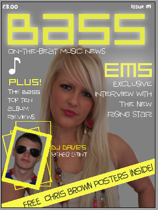
I called my magazine 'Bass', because there is a lot of bass in the Dance music genre, and I wanted to include dance music into my magazine because it was popular in the questionnaire.
I gave the masthead a white glow, so it stands out and is eye catching for the buyer, with a vibrant, urban look. The only other text I used a glow for was ‘Ems ’ because after the masthead, it is the most important word on the front cover, being the main feature.
I decided on my slogan being “On-the-beat music news” because it gives the feeling of the magazine being up-to-date and fresh, because on-the-beat is referring to a music beat, and also it means to be current.
My main image is of the pop star ‘Ems ’, and is anchored by her name in yellow, and the words “exclusive interview with the new rising star”. These words aim to entice the buyer, because ‘exclusive’ is an important word in media, meaning no other magazine (or radio/tv channel etc.) has had this interview, therefore this is the only magazine you can buy to read this interview. The image is of Ems looking straight at the camera, which suggests honesty, but her smile is closed, implying a certain amount of information might be withheld. She has her hand on her hip which suggests attitude, which I tried to incorporate into my magazine.
The image of ‘DJ Dave’ is anchored by the text explaining he has been in rehab, and the border and other rectangles surrounding this image are made to have a psychedelic-look, relating to the fact that he went to rehab to cure his drug-addiction- drugs make you spaced out, and the angle of the picture makes it seem as though DJ Dave is spiralling downwards, because of his addiction.
The strip of yellow at an angle at the bottom of the page stands out against the grey background to catch the buyer’s eye. The text being in capitals makes the words stand out, and because the posters are free, the buyer is more inclined to purchase the magazine because they don’t have to pay extra.
The Images I took for my magazine
For my music magazine, I had to choose a person I knew to take pictures of to go on the front cover and to be the focus of my double page spread. I chose my friend Emily, and her brother David, who will also be on the front cover, but as another feature which will not be used on the double page spread. I also plan to include an advertisement on the first inside page of my magazine, as they often have in magazines, hence the image of grass at the bottom. Here are a selection of the un-edited images I took and will use in my magazine:


Ideas for my magazine- Double page spread
The final piece of planning I had to do was on my double page spread. I designed three layouts for these pages, making sure I allotted a space for a page title, images, an introduction and the interview itself:


I chose to use layout three, because it included space for more than one or two images, and one page is just the interview, which makes it more clean-cut and tidy. In my double page spread, the page title will be in pink, to show the femininity of the subject of my interview, who is going to be a girl. The font will be the same as the masthead on the front page to stay with the same themes. The coloured block behind her will be in the same pink, so the theme follows on from the title. The image on the left hand page will be a full length image of the artist who I will style in a specific way. The introduction will flow around the image, and will be written in grey, in one of the fonts used in the front cover. On the facing page, there will be an image stretched across the bottom of the page, a cut of one of the images I will take, to add interest. There will be three images in the middle of the page, all different, of the artist. The interview will flow down both sides of these three images, in a simple, clear font, easy for the reader to read. The interviewer's text will be in the same grey as the introduction and the artist's will be in the same pink as the page title
Ideas for my Magazine- Contents layout
 After designing a front cover layout, I then had to think about the contents page of my magazine. The following are a few of the designs I came up with for my music magazine contents' page...

I decided to use the second layout, because I thought it looked spacious and clearly laid out, with different boxes containing the contents so locating a specific feature within the magazine would be easy.
The title of the page will be "Bass Contents.." in the same font as the masthead on the front cover, so it ties in with the same fonts and themes. The colour scheme on the contents page will follow on from the front cover, with the grey white and yellow. The background will be white, to contrast from the grey of the front, but the text will be grey and the boxes will have a yellow outline. There will be three main text boxes on the contents page, one under the title on the left, which will include the "on the cover" features, and clearly marked page numbers, another box will be under this one but to the right, which will be the "regulars" features, and the last box will be the "also inside" features. Each box will have a picture which relates to it, to the side of it, either the left or right, depending on the spacing, also with page numbers next to it.
Ideas for my Magazine- Front page layout
Before I could get started on creating my magazine, it was a good idea to plan where each of the features would go on the front page. I needed to include a space for the masthead, slogan, blurb, symbol, main image, anchorage text, other images and anchorage text, puffs and other features.
Here are a few of the layouts I designed before I chose the best one:


I decided to choose layout number 3, because it has a clear layout, with room for all the features to be laid out with room for enlargement or movement.
I have followed the codes and conventions of a typical music magazine with the masthead at the top of the page in the middle in a large font which stands out. The main image will be central to the front cover and in a large size so it catches the eye, with the anchorage text on the right hand side. The background will be grey, which I decided because of the font design for the masthead- grey and yellow. I will include a slogan underneath the masthead to sum up what the magazine is about. for example I may use a slogan similar to NME magazine's slogan- "first for music news". I will include a symbol or emblem on my front cover, under the slogan and to the left. It will be something related to music, perhaps a musical note or musical instrument. I will add 'other features' onto the front, on the left hand side so it doesnt clash with the main image and its' anchorage text. I will include another, smaller image of a feature within the magazine, to the bottom left of the page, to add contrast and show the reader that there is more than one interesting story inside. the anchorage text will slightly overlap the main image, to the right of the smaller image. The puffs will be at an angle across the bottom right corner. I will add a background to it so it stands out against the other features and the background. The blurb will be situated at either corner above the masthead.
Ideas for my Magazine- Masthead
In order to create a professional-looking music magazine I needed to come up with an effective Masthead, with a relevant font and colour. I chose the name 'Bass' because you hear a lot of bass in dance music, and I wanted to include dance music in my magazine. Here are a selection of the fonts I could have used for my magazine.


I decided to use the ringed font; PlatinumBeat BTN, because it looked funky and urban, and I wanted my magazine to be very 'now' and 'street'.
AfterI had chosen a font, I then had to come up with a colour scheme to tie in with the front cover and the font. Here are a few designs I came up with.

I decided to go with the grey background and yellow lettering because I feel it stood out against the rest of the designs and could be made to look very urban, with font glows and bright colours. The dull grey is brought to life by the bright yellow and the eye is very drawn to the yellow because it stands out so much against the grey, whereas other designs such as the black on white or the yellow on white, are not particularly appealing.
Researching Current Music Magazines- Double Page Spread

Tuesday, 5 April 2011
Researching Current Music Magazines- Contents

A title for the page- including the white 'Q' on the red background which is on the front page and so follows the same theme
Subheadings- 'Features', 'Every month' and 'Q Review'. These also tie in with the theme seen on the front cover, and attention is drawn to them because it is the main colour (apart from the white background) on the contents page. These subheadings make it easy to locate a specific feature within the magazine, you simply look up which category it's likely to fall into.
Images- which are related to the contents stated on the page. The large image will be anchored to a feature of great importance or interest to the readers. the page numbers next to the features are in a different colour to the actual feature, making finding the right page quickly, easy.

Subscribe to:
Posts (Atom)