Thursday, 7 April 2011

Analysing my Music Magazine- Double Page Spread

This image is of my double page spread for my music magazine, "Bass".
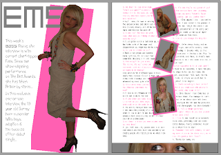
The theme of the magazine being grey, white and yellow is slightly altered on these pages, in the way that the yellow hass been replaced with baby pink so it is more relevant to the feature- in particular the artist that the article is about. I decided to call my artist "Ems" which is a nickname for my model's actual name- Emily. I wrote her name in pink in the same font as the masthead on the front cover (platinum beat btn) which contrasts to the white background and catches the eye. The image on the first page of the double page spread is a full length one of Ems standing side on but looking at the camera, with one knee bent behind her. I dressed my model in an ankle-length plain beige jumpsuit and brown high heels, but added splashes with her jewellry- I added a lot of multi-coloured bracelets, necklaces and earrings, and bright lipstick. She wore her hair straight and smooth to add some glamour. I dressed Ems in this way because the look I wanted to create was one of a young, modern, down to earth girl, so the readers can relate to her and be more inclined to buy the magazine. I cut out the background of the original image on Corel photoshop X2 and then added a block of colour behind the image at an angle, which made it stand out against the white background and added an element of colour to the page. The introduction to the interview wraps around the image, to the left, and is written in the same alternative font I used on the front cover, and in grey, so as to carry the theme on into the magazine. On the facing page, I used four images, three down the centre of the page and one at the bottom. The three in the middle are at angles to each other and have a border in the same pink colour as the block background on the opposite page. These three are all images which shows a fun side to Ems. The image at the bottom was cut from one of the central images, it shows just her eyes, and I have included the grey background which makes it appear as though Ems is looking through blinds or a letterbox. This shows a misschevious side and is eye-catching and interesting for the reader. I chose to use a variety of images in the double page spread so I could create a good balance between text and pictures, so there was more visual effects to the feature. The interview itself flows around both sides of the central images and the text wraps around the pictures. The interviewer's text is in the same grey as the introduction and Ems' text is in the same pink as the page title and other pink features, in order to co-ordinate with the theme, and to make reading the interview simpler for the reader, also to make sure the words stand out from the white background. The font is simple and easy to read. I think it works well as a double page spread because it is easy to read, with a good balance of text and images, with different fonts and colours which attract the eye.
Analysing my Music Magazine- advertisement

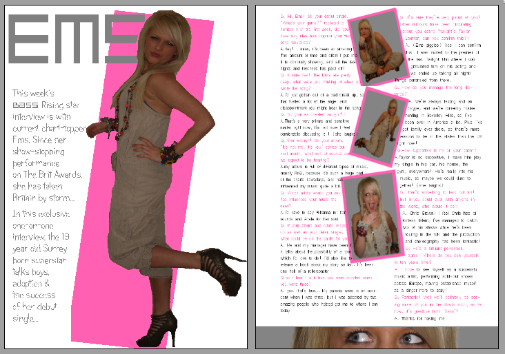
I decided to create an 'advert' for the page before the contents page in my magazine, because professional magazines often include advertisements. I chose to advertise a fragrance from (made up) brand "Belle Femme" which means "beautiful woman" so it is clear that the fragrance is for women. The advert is very simple; just an image I took of of grass in the sun. following on from the theme of the image, I called the fragrance "spring" which I wrote in a font called "gigi", in white which is a very fresh, spring colour. I used the same font for the words at the bottom, which just describe the advert and what brand has made the fragrance.

Analysing my Music Magazine- front cover

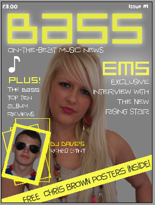
The image below is of the front cover of my music magazine:

I called my magazine 'Bass', because there is a lot of bass in the Dance music genre, and I wanted to include dance music into my magazine because it was popular in the questionnaire.
From doing research on various current music magazines and concluding that they often use plain backgrounds so a bright coloured font would stand out, I decided to use a plain grey background, and two bright colours; yellow and white. For the masthead and important wording such as ‘Ems’, ‘Plus!’ and ‘DJ Dave’s’, I used a bright yellow font called “Platinum beat btn” and all the other text such as the slogan, the issue number and price, the musical symbol, the anchorage text for the central image, the text under ‘Plus!’ and ‘DJ Dave’s’ are in a white font called “iguana lover btn”. I did this so that all the text ties in with the same theme and can link together the main text and subtext. The only grey writing was on the yellow strip, where the yellow or white font would not stand out, but its being grey, makes it tie in with the theme.
  I gave the masthead a white glow, so it stands out and is eye catching for the buyer, with a vibrant, urban look. The only other text I used a glow for was ‘Ems’ because after the masthead, it is the most important word on the front cover, being the main feature.
  I decided on my slogan being “On-the-beat music news” because it gives the feeling of the magazine being up-to-date and fresh, because on-the-beat is referring to a music beat, and also it means to be current.
  My main image is of the pop star ‘Ems’, and is anchored by her name in yellow, and the words “exclusive interview with the new rising star”. These words aim to entice the buyer, because ‘exclusive’ is an important word in media, meaning no other magazine (or radio/tv channel etc.) has had this interview, therefore this is the only magazine you can buy to read this interview. The image is of Ems looking straight at the camera, which suggests honesty, but her smile is closed, implying a certain amount of information might be withheld. She has her hand on her hip which suggests attitude, which I tried to incorporate into my magazine.
  The image of ‘DJ Dave’ is anchored by the text explaining he has been in rehab, and the border and other rectangles surrounding this image are made to have a psychedelic-look, relating to the fact that he went to rehab to cure his drug-addiction- drugs make you spaced out, and the angle of the picture makes it seem as though DJ Dave is spiralling downwards, because of his addiction.
   The strip of yellow at an angle at the bottom of the page stands out against the grey background to catch the buyer’s eye. The text being in capitals makes the words stand out, and because the posters are free, the buyer is more inclined to purchase the magazine because they don’t have to pay extra.

The Images I took for my magazine

For my music magazine, I had to choose a person I knew to take pictures of to go on the front cover and to be the focus of my double page spread. I chose my friend Emily, and her brother David, who will also be on the front cover, but as another feature which will not be used on the double page spread. I also plan to include an advertisement on the first inside page of my magazine, as they often have in magazines, hence the image of grass at the bottom. Here are a selection of the un-edited images I took and will use in my magazine:


Ideas for my magazine- Double page spread

The final piece of planning I had to do was on my double page spread. I designed three layouts for these pages, making sure I allotted a space for a page title, images, an introduction and the interview itself:


I chose to use layout three, because it included space for more than one or two images, and one page is just the interview, which makes it more clean-cut and tidy. In my double page spread, the page title will be in pink, to show the femininity of the subject of my interview, who is going to be a girl. The font will be the same as the masthead on the front page to stay with the same themes. The coloured block behind her will be in the same pink, so the theme follows on from the title. The image on the left hand page will be a full length image of the artist who I will style in a specific way. The introduction will flow around the image, and will be written in grey, in one of the fonts used in the front cover. On the facing page, there will be an image stretched across the bottom of the page, a cut of one of the images I will take, to add interest. There will be three images in the middle of the page, all different, of the artist. The interview will flow down both sides of these three images, in a simple, clear font, easy for the reader to read. The interviewer's text will be in the same grey as the introduction and the artist's will be in the same pink as the page title

Ideas for my Magazine- Contents layout

After designing a front cover layout, I then had to think about the contents page of my magazine. The following are a few of the designs I came up with for my music magazine contents' page...


I decided to use the second layout, because I thought it looked spacious and clearly laid out, with different boxes containing the contents so locating a specific feature within the magazine would be easy.
The title of the page will be "Bass Contents.." in the same font as the masthead on the front cover, so it ties in with the same fonts and themes. The colour scheme on the contents page will follow on from the front cover, with the grey white and yellow. The background will be white, to contrast from the grey of the front, but the text will be grey and the boxes will have a yellow outline. There will be three main text boxes on the contents page, one under the title on the left, which will include the "on the cover" features, and clearly marked page numbers, another box will be under this one but to the right, which will be the "regulars" features, and the last box will be the "also inside" features. Each box will have a picture which relates to it, to the side of it, either the left or right, depending on the spacing, also with page numbers next to it.

Ideas for my Magazine- Front page layout

Before I could get started on creating my magazine, it was a good idea to plan where each of the features would go on the front page. I needed to include a space for the masthead, slogan, blurb, symbol, main image, anchorage text, other images and anchorage text, puffs and other features.

Here are a few of the layouts I designed before I chose the best one:
I decided to choose layout number 3, because it has a clear layout, with room for all the features to be laid out with room for enlargement or movement. 
I have followed the codes and conventions of a typical music magazine with the masthead at the top of the page in the middle in a large font which stands out. The main image will be central to the front cover and in a large size so it catches the eye, with the anchorage text on the right hand side. The background will be grey, which I decided because of the font design for the masthead- grey and yellow. I will include a slogan underneath the masthead to sum up what the magazine is about. for example I may use a slogan similar to NME magazine's slogan- "first for music news". I will include a symbol or emblem on my front cover, under the slogan and to the left. It will be something related to music, perhaps a musical note or musical instrument. I will add 'other features' onto the front, on the left hand side so it doesnt clash with the main image and its' anchorage text. I will include another, smaller image of a feature within the magazine, to the bottom left of the page, to add contrast and show the reader that there is more than one interesting story inside. the anchorage text will slightly overlap the main image, to the right of the smaller image. The puffs will be at an angle across the bottom right corner. I will add a background to it so it stands out against the other features and the background. The blurb will be situated at either corner above the masthead.